Data Viz
Project Overview
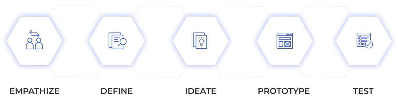
I focused on Design Thinking methodology which helps in addressing complex design problems by understanding the user needs and pain point
My Contribution
My Role
My Role as a UI/UI designer was to identify the pain points of the data analytics team and stakeholders, generate user-centric solutions, develop a visual style for data analytics dashboards, and make the dashboards user-friendly by applying UI/UX principles.
Project Description
The Chainlink Data Analytics team provides business-focused insights, helping Chainlink Labs navigate the data analytics process efficiently. They ensure high-quality data and advanced statistical analysis are delivered to the business and translated into actionable decisions.
Project Type
UI/UX Design for Business Intelligence
Tools
Figma, Adobe XD, Power BI
ChainLink Labs
Chainlink is a decentralized network built on Ethereum. The network is intended to be used to facilitate the transfer of tamper-proof data from off-chain sources to on-chain.
Chainlink Data Analytics team generate and propagate business focused insights, accelerating Chainlink labs move through the Data Analytics life cycle, ensuring the highest quality data and complex statistical analysis is consumed by business and translated into action.
.png)
My Process
I focused on Design Thinking methodology which helps in addressing complex design problems by understanding the user needs and pain points.
Empathize
During the empathize phase, I conducted interviews with Data Analysts. We also collaboratively developed multiple Power BI reports from scratch. This allowed me to communicate with stakeholders and gather feedback and pain points from different departments.
New unfamiliar data analytics tool
I identified the primary user groups and collaborated with stakeholders to surface the key questions users needed the data to answer. This ensured the dashboards were designed around real business and product needs rather than raw data output.
Ideate
Ones I've gathered enough data, I've started to generate ideas which could address user needs
Prototype
I designed polished, high-fidelity dashboards that balanced clarity, precision, and usability, aligning data presentation with business objectives.
Test
Throughout the project, I iterated on designs based on stakeholder feedback, continuously improving clarity, usability, and alignment with key goals such as adoption, trust, and informed decision-making.
Problem and Gole
My work with Chainlink began with a detailed task. The company asked me to create a reusable Power BI mockup for the Data Analytics team, specifying visual design principles in various layouts.
.png)
Inconsistent dashboard design
The current company dashboards lack a unified visual style and consistent user experience, increasing cognitive load for users when reviewing and interpreting new information.
New unfamiliar data analytics tool
Power BI was a new tool for both the Data Analytics team and the business, requiring time for users to adapt to its functionality and fully leverage the platform’s capabilities. Tight deadlines and evolving requirements also added pressure to the dashboard development process.
Data Insights Complexity
Transforming complex data insights into clear, intuitive, and visually accessible experiences was a key challenge for the Data Analytics team, particularly when designing dashboards that could be easily understood by stakeholders with varying levels of technical expertise.
.png)
Consistent and Engaging design
My goal was to develop strong, visually appealing look for al data visualization projects, offering a familiar "web-like" experience that makes navigation user-friendly.
Guidelines and Frameworks
The supporting documentation was created to ensure consistency and establish best practices across the dashboard development process. The Power BI guidelines also helped users and stakeholders become more familiar with the platform and its core functionality.
From Complexity to Clarity
Collaborating closely with the Data Analytics team enabled the development of user-centered dashboard experiences that improved the accessibility, clarity, and usability of complex data insights for stakeholders across the organization.
User Story
Synthesizing the data from the interviews, I was able to form user personas and their pain points. This subsequently allowed me to write definitive problem and hypothesis statements, and formulate their user journeys. The user journey maps helped me understand the problems the user faced on their paths. It also helped reduce the impact of my own biases, by understanding how the users think and feels though every step.
User Story
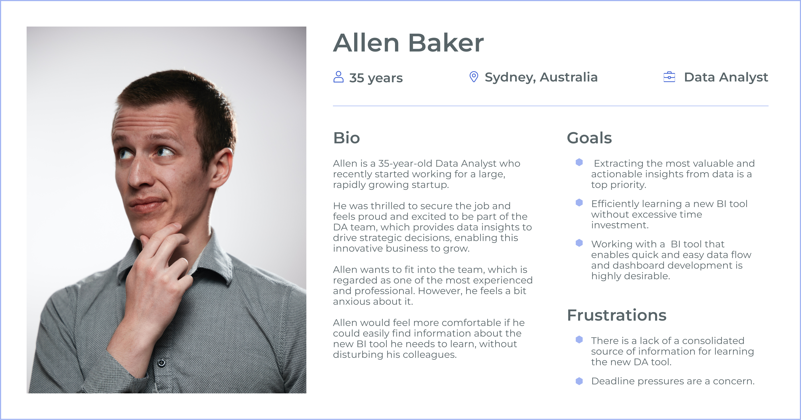
Allen, as a data analyst, wants a punchy and insightful dashboard so that he can share data insights with stakeholders in a way that drives better decision-making and inspires meaningful, actionable outcomes.
Problem Statement
Allen is a data analyst who needs to quickly and easily learn a new data analysis (DA) tool because he wants to deliver an insightful and meaningful dashboard on time to improve stakeholder decision-making.
Allen also needs to reduce the time spent on dashboard development without sacrificing quality, as he is under pressure to meet tight deadlines.
Hypothetical Statement
If Allen had a consolidated and reliable source of information about the new tool, such as step-by-step tutorials or documentation, he would have a less stressful learning experience and could decrease the time required for learning.
If Allen had an in-team consultant to answer questions about the new BI tool, such as a designated Power BI expert or mentor, he would feel less pressured about seeking help from team members and could resolve issues more efficiently.
If Allen had a Power BI mock-up with specified visual design principles, such as pre-built templates for dashboards or guides on aligning charts with stakeholder priorities, he could spend less time developing the report while maintaining high quality and meeting stakeholder expectations.
User Story
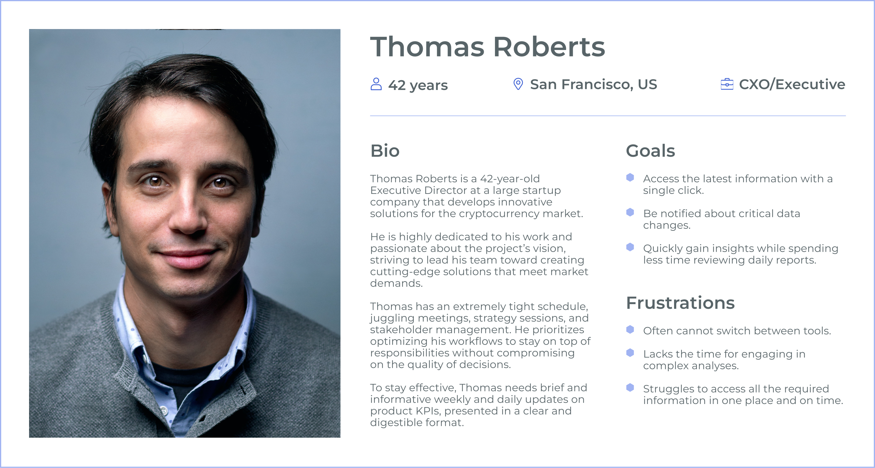
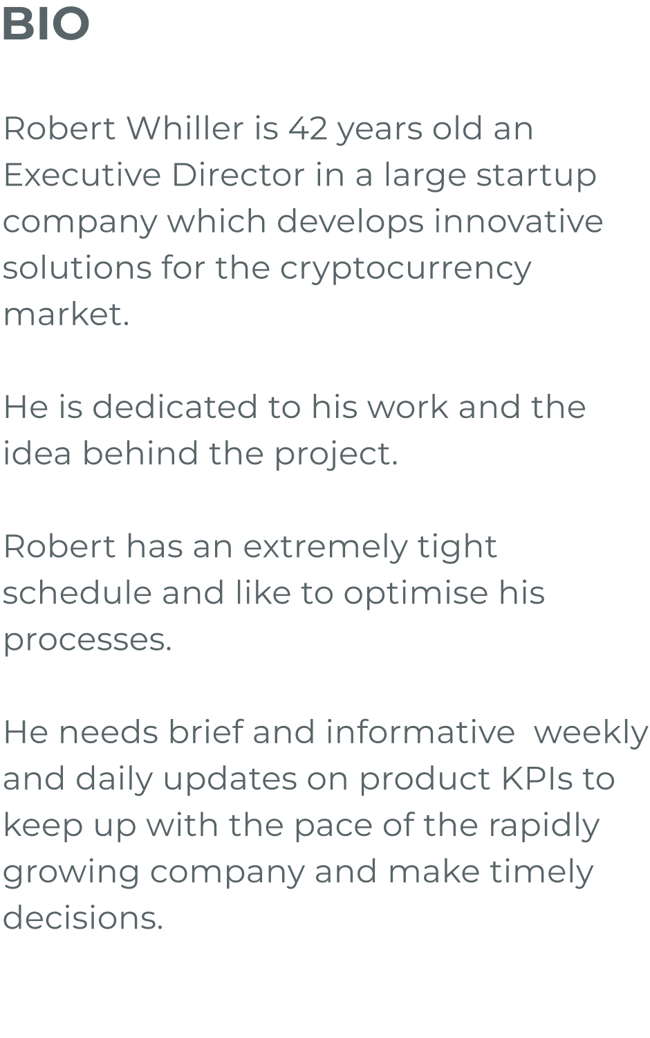
As an Executive Director with a demanding schedule, Thomas Roberts want to receive concise and actionable updates on product KPIs in real time so that he can make informed decisions quickly without wasting time navigating multiple tools.
Problem Statement
Thomas Roberts, a busy Executive Director, struggles to access critical product KPIs in a single, consolidated platform. He lacks real-time notifications and streamlined insights, which hampers his ability to act promptly and effectively in the fast-paced cryptocurrency market.
Hypothetical Statement
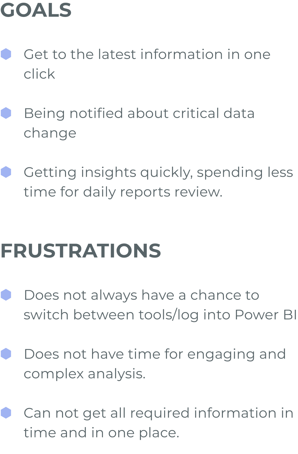
If Thomas had a centralized dashboard that provided all critical KPIs at a glance, he could save time and focus on decision-making.
If Thomas received real-time notifications about significant data changes, he could address urgent issues without delay.
If Thomas could access daily and weekly KPI reports in a concise format with minimal effort, he would avoid wasting time logging into multiple tools or performing manual reviews.
If Thomas had an automated report that prioritized key insights, he would spend less time analyzing data and more time strategising.


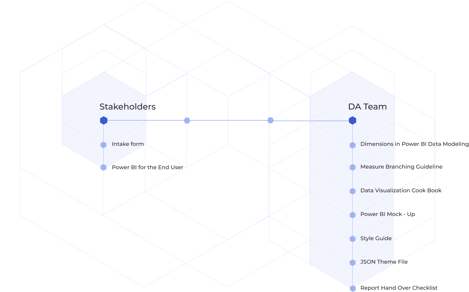
Dashboard UX Process
Defining a dashboard development process is crucial for ensuring that dashboards are not only functional but also effective in delivering insights to end-users. The structure I've eventually created was used as a best practice for effective and transparent collaboration between teams.
.png)
Request
The stakeholder submits a request to the DA team using the intake form.
Meeting
The parties arrange a meeting to clarify requirements.
Data Preparation
The data scientist uploads the data into a data visualization tool and prepares it for complex logic development.
Dashboard Structure
The designer works on the report structure based on the initial requirements. After completing this stage, the designer requests feedback from the stakeholder.
Data Visualization
The data scientist and designer collaborate to develop low-fidelity data visualizations. After incorporating stakeholder feedback, they create a high-fidelity prototype.
Delivering the Dashboard
The dashboard is handed over to the stakeholder for review and feedback. Once the necessary changes are made, the report is published to production and moved to the maintenance stage.
Guidelines and Frameworks
Guidelines and frameworks play a crucial role in helping data analytics teams and stakeholders by streamlining workflows, ensuring consistency, and fostering better communication.
Style Guide
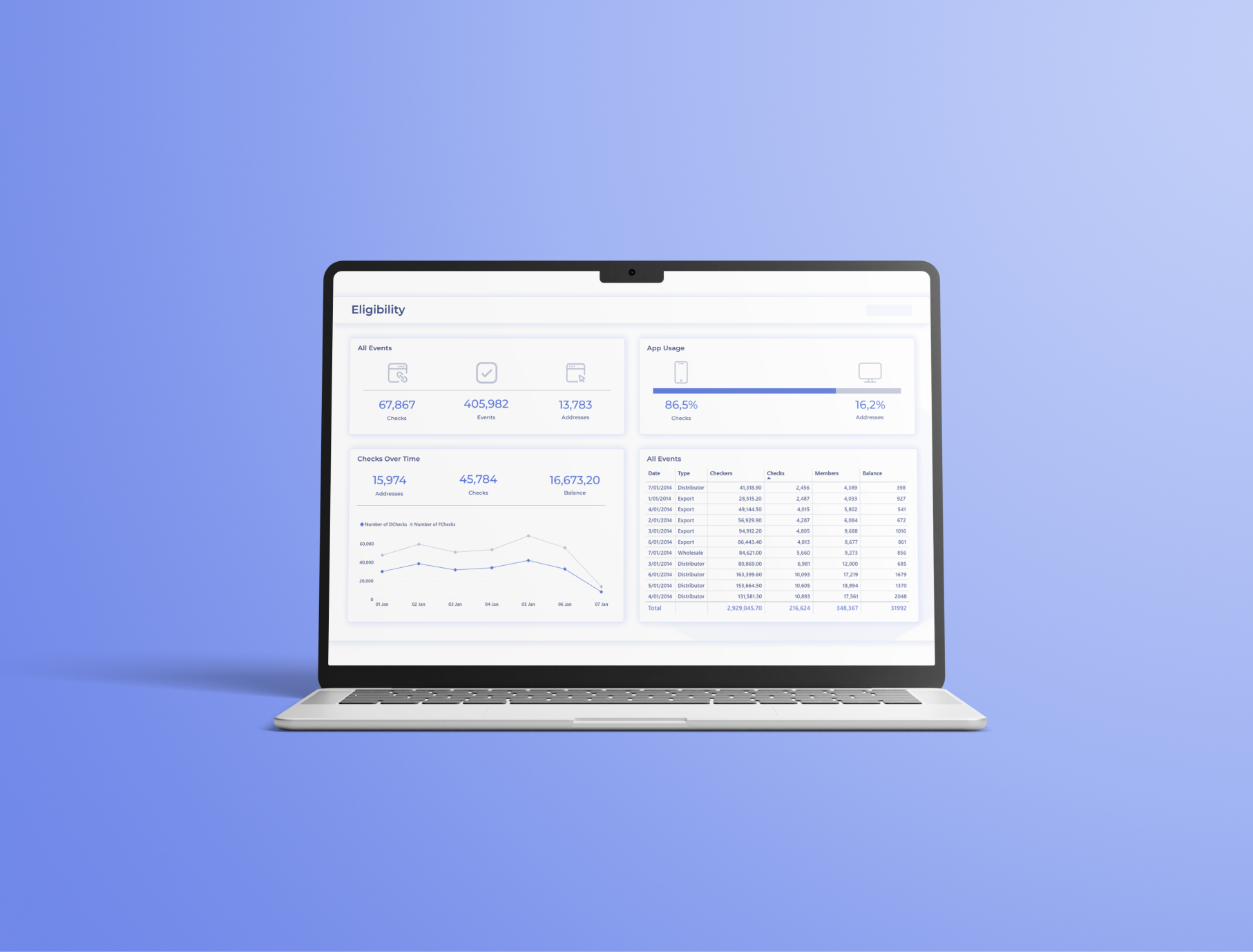
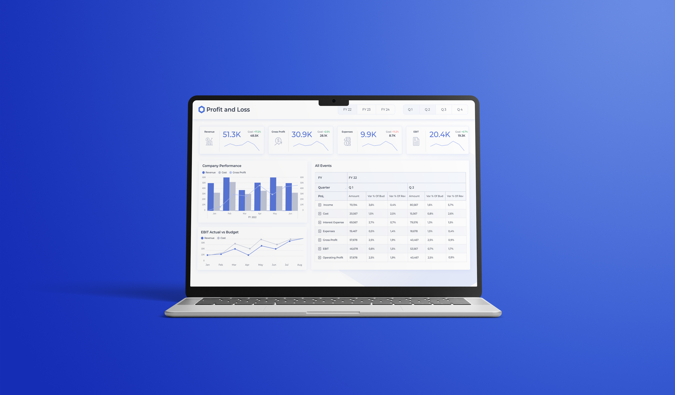
I developed scalable UI components and reusable design patterns to support future data sources, ensuring long-term consistency, usability, and flexibility across the platform. In addition, I created a structured JSON file for the Power BI data analytics tool used within Chainlink, enabling visual design properties such as colors, typography, and layout rules to be transferred into the tool efficiently and applied consistently across dashboards.
.png)
.png)

.png)

.png)


Wireframing
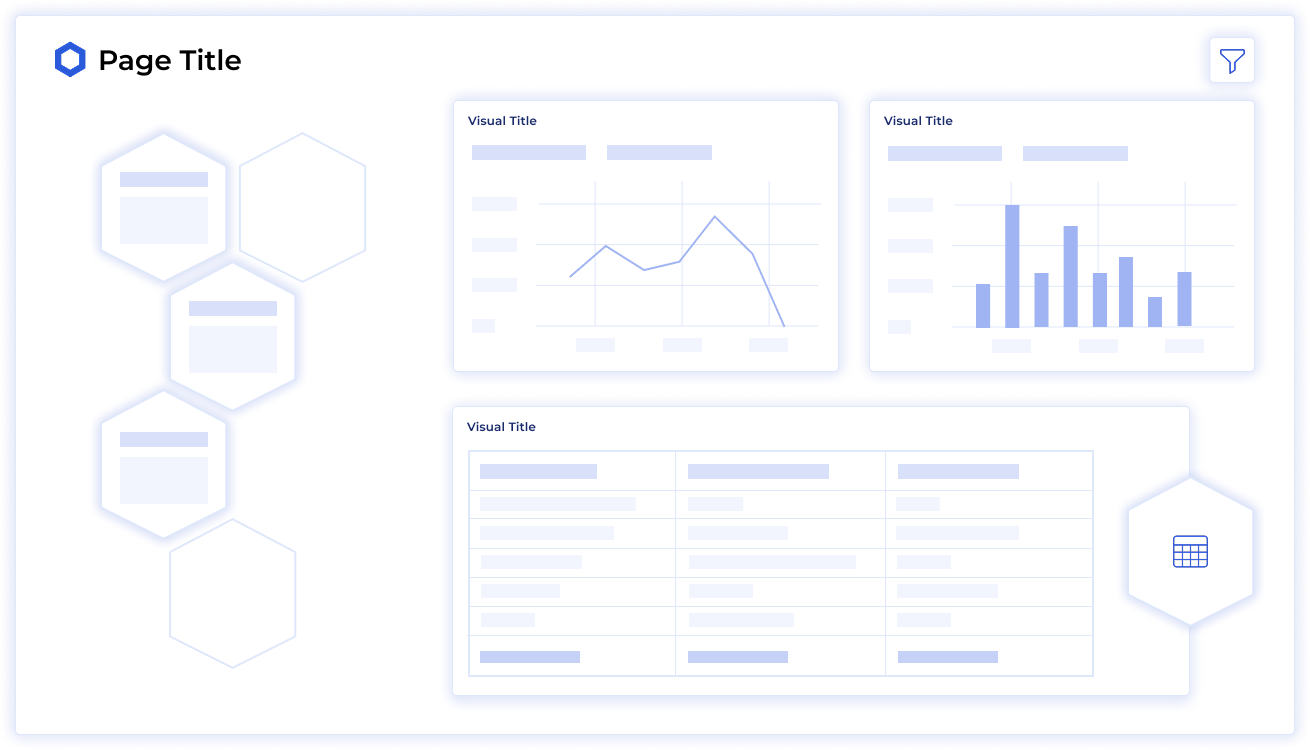
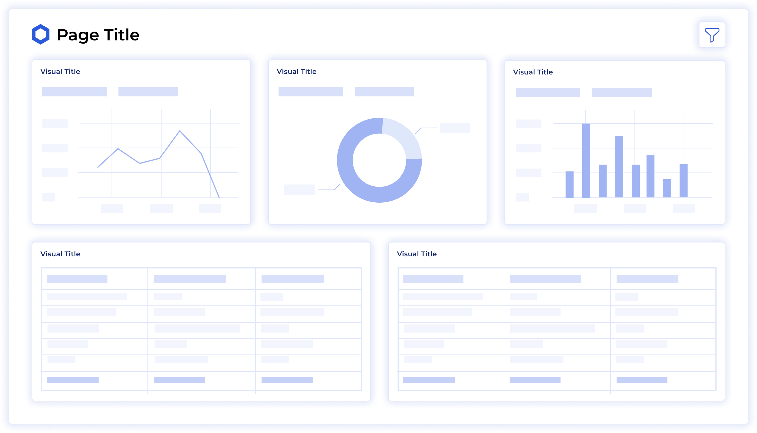
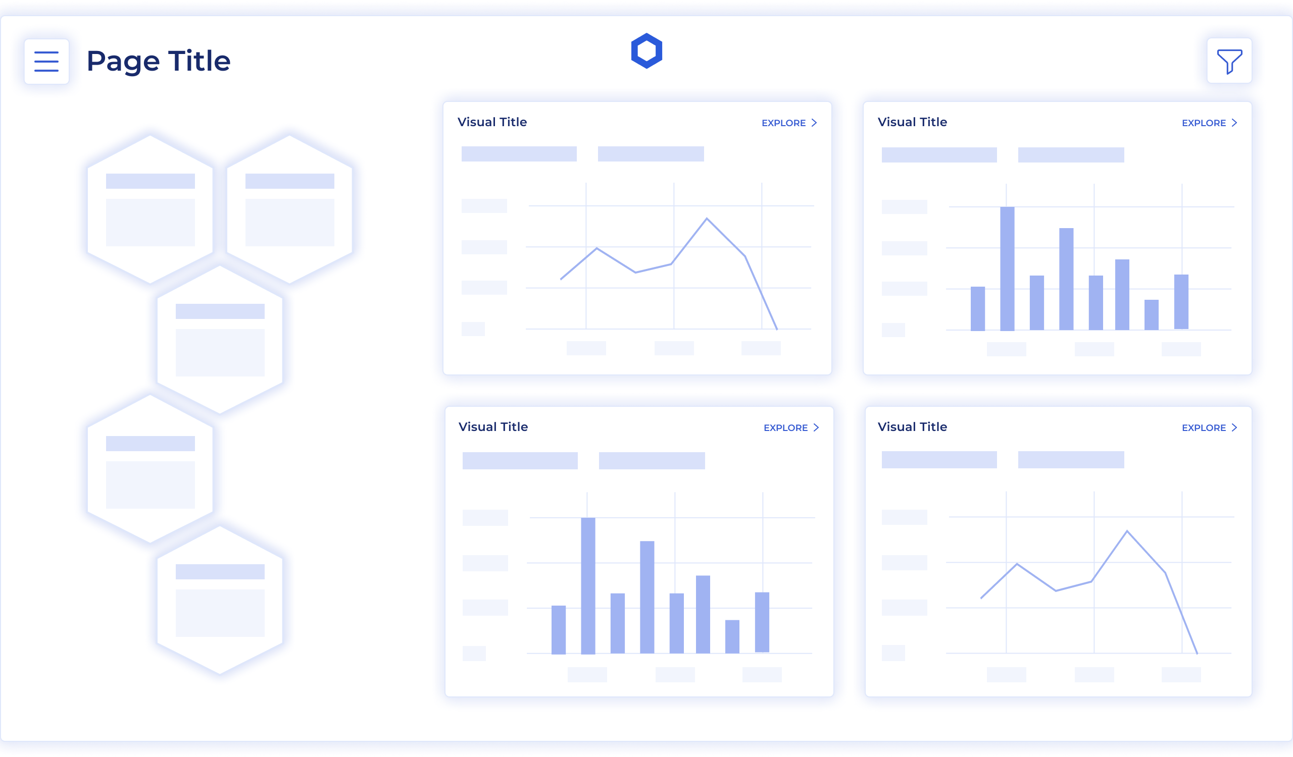
Prototyping
High fidelity prototypes were developed.
.png)
.png)
.png)
.png)
JSON Theme File
To help the data analytics team transfer the design from Figma to Power BI, I created a JSON theme file. The file defines all design principles, including typography, colors, spacing, and design components.
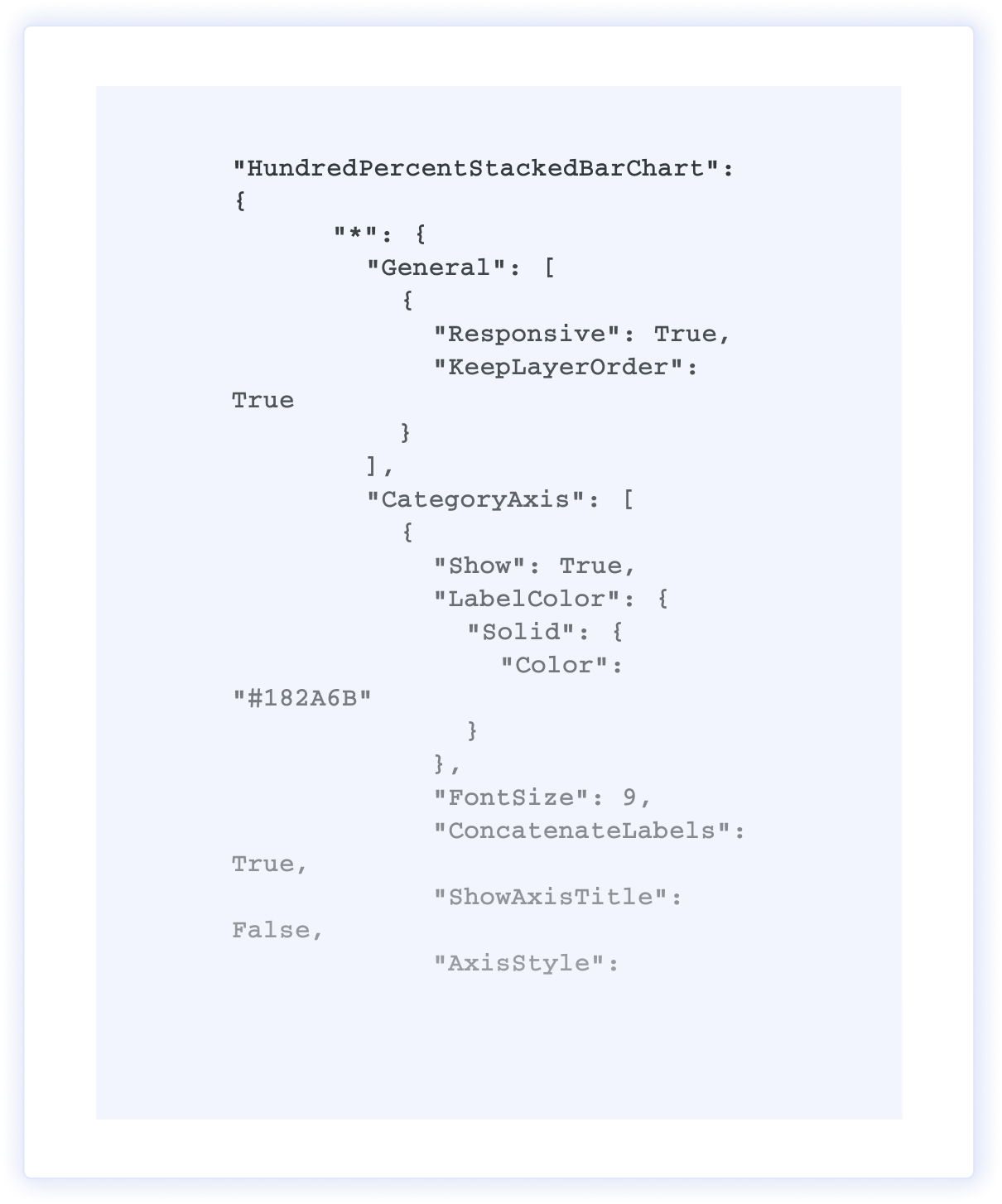
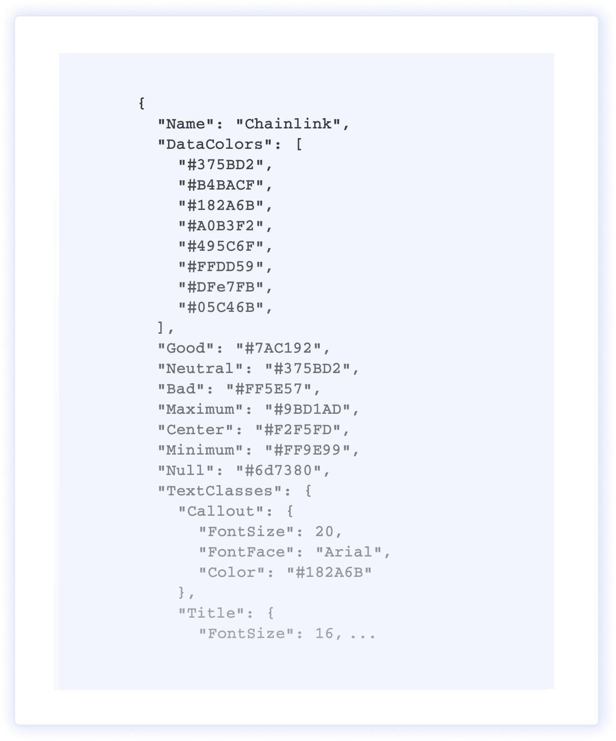
JSON Theme File
To help the data analytics team transfer the design from Figma to Power BI, I created a JSON theme file. The file defines all design principles, including typography, colors, spacing, and design components.
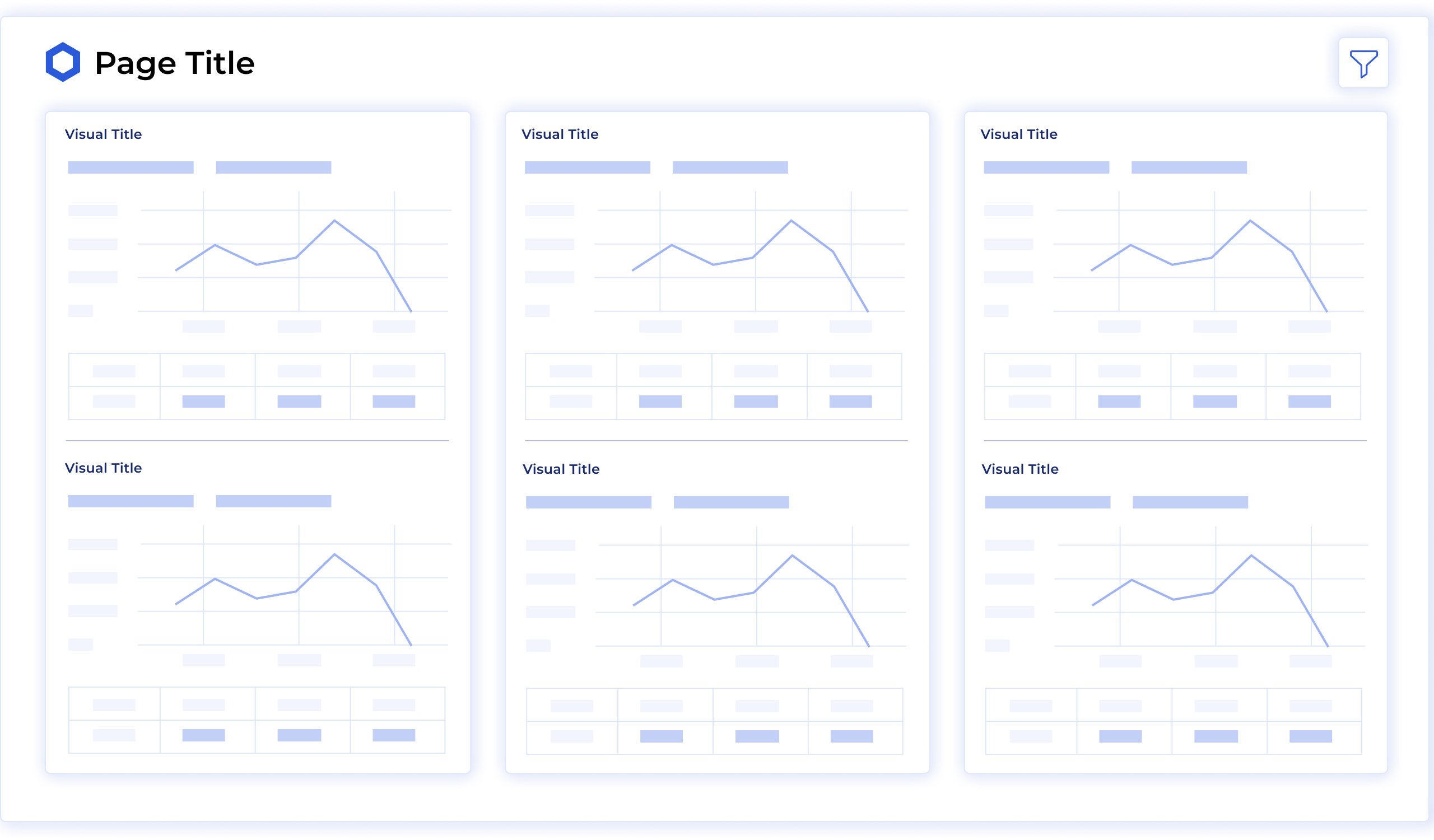
Final Outcome
The redesigned dashboards significantly improved the clarity and accessibility of complex blockchain and market data for both internal teams and external partners. By establishing a consistent visual system, intuitive interaction patterns, and scalable design components, users were able to discover insights faster and make more informed decisions without requiring deep technical expertise.
The introduction of a structured design system and a JSON-based visual configuration for Power BI enabled more efficient dashboard development and easier maintenance, reducing design-to-implementation friction for data and engineering teams. Overall, the project strengthened alignment between data presentation and business objectives, supporting improved onboarding, increased product adoption, and greater trust in Chainlink’s data-driven decision-making.
.png)
Related Works
Explore a selection of my featured works that showcase creativity and attention to detail turning ideas into impactful experiences.
Explore a selection of my featured works that showcase creativity and attention to detail turning ideas into impactful experiences.